Community Savings are an established charity in Jersey helping those who experience financial difficulties. Their existing logo was very dated and the entire brand in need of modernising. Supported by Santander International, the client’s research had shown that they urgently needed to raise awareness and boost the profile of Community Savings within the general community including potential clients and young people.
Community Savings Rebrand
CREATIVE + BRANDING + WEBSITE + SIGNAGE
The Brief..


What we did..
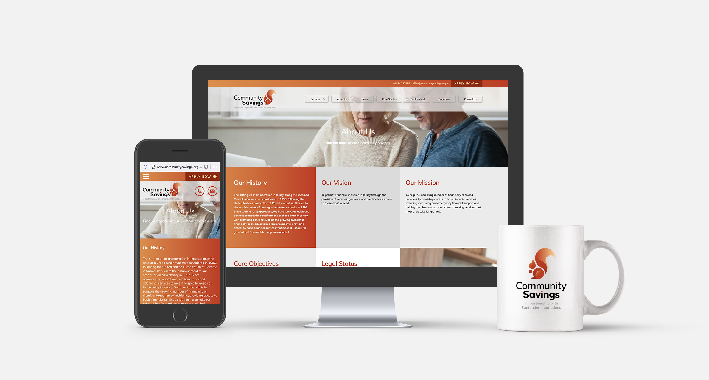
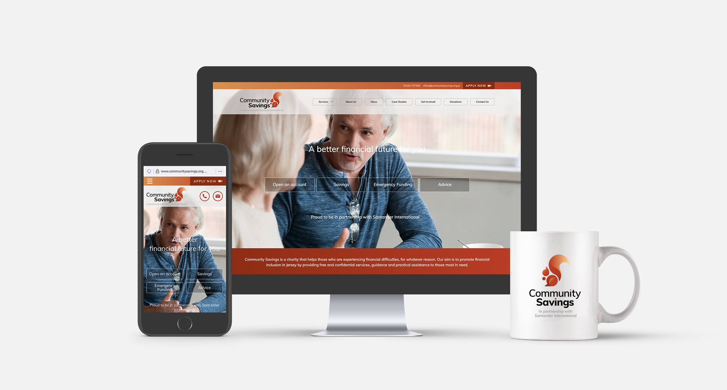
The charity required a personality that was both sympathetic to those requiring its services and also engaging enough to attract potential benefactors and supporters. This was brought to life via a red squirrel icon as both a metaphor for saving and planning ahead and also a symbolic representation of Jersey itself.
The website as a communications hub was essential to automate as many day-to-day enquiries and functions as possible as a time and cost saving tool. When dealing with such sensitive and stressful matters, clear calls to action and directions were made a priority. All design, coding, hosting and security updates for the site are handled by The Refinery.
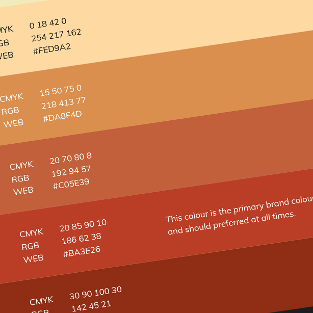
The rebrand was comprehensive and required a consistent approach to its application across stationery, forms, event branding, interior and exterior signage and social media plus the creation of an image library of appropriate photography


